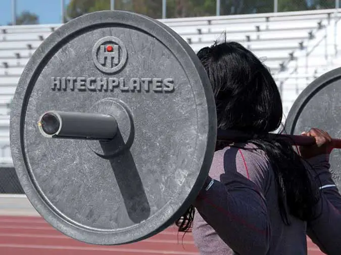
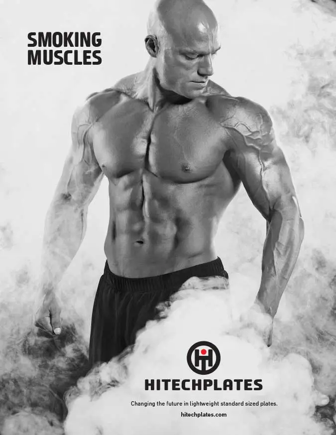
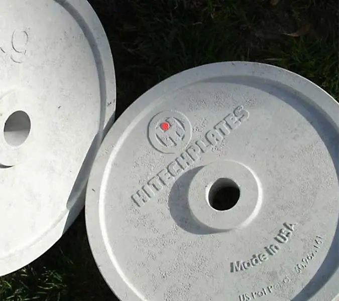
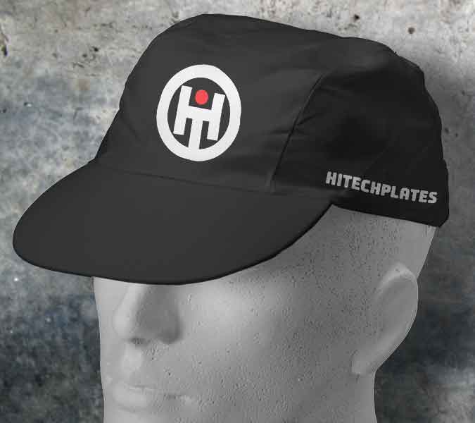
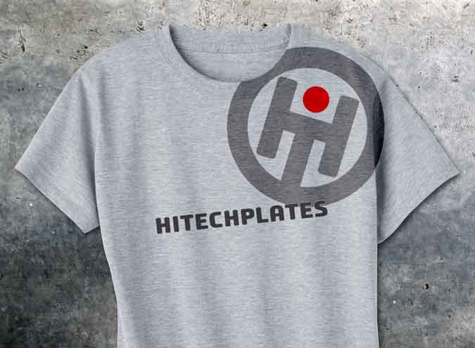
A California lifting weights company called HiTech Plates engaged me to develop an identity program appealing to hard core body builders seeking professional-level barbells.
As the centerpiece of this branding program, I designed a logo which combines the H and T initials of the name into a representation of a figure lifting a barbell.
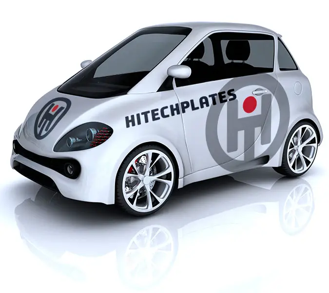
By employing thick lines, hefty typography, and the stark use of black, grey and red, the logo is an iconic representation of over-the-top strength which vibes perfectly with the weightlifting clique.