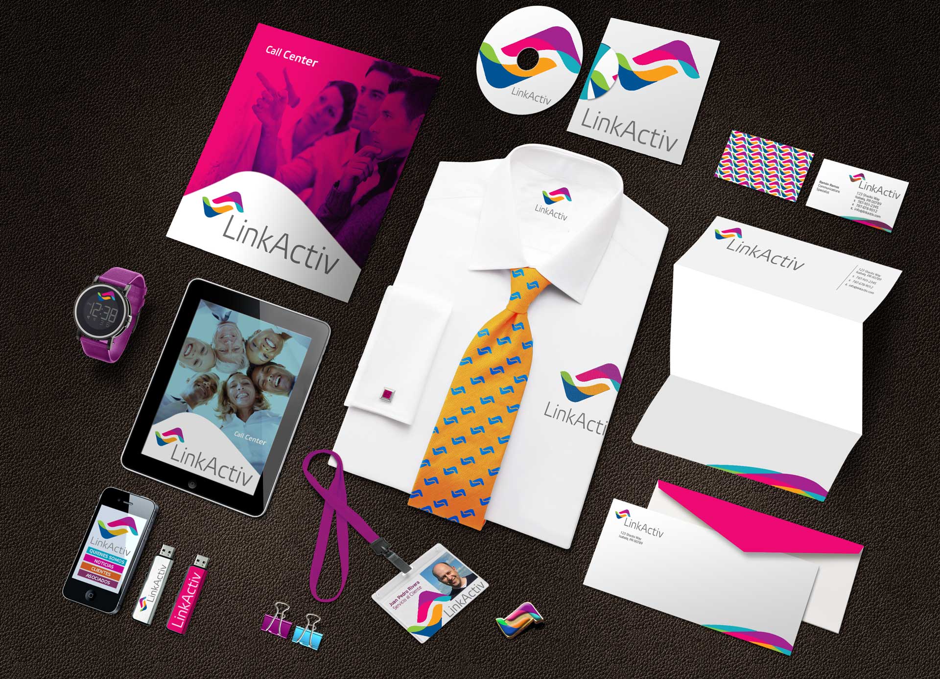
The direct marketing and call center firm, El Día Directo, approached me to develop a new brand identity that would support its growth and expansion into new markets. A key objective of this initiative was to establish a distinct identity separate from its parent company, the daily newspaper El Nuevo Día, as the firm was now operating independently.
The first step was to create a new name that would resonate with U.S. and international clients seeking specialized call center services for Hispanic markets. After exploring several possibilities, I proposed the name LinkActiv—a name that effectively captures the company’s mission of fostering dynamic and efficient connections.
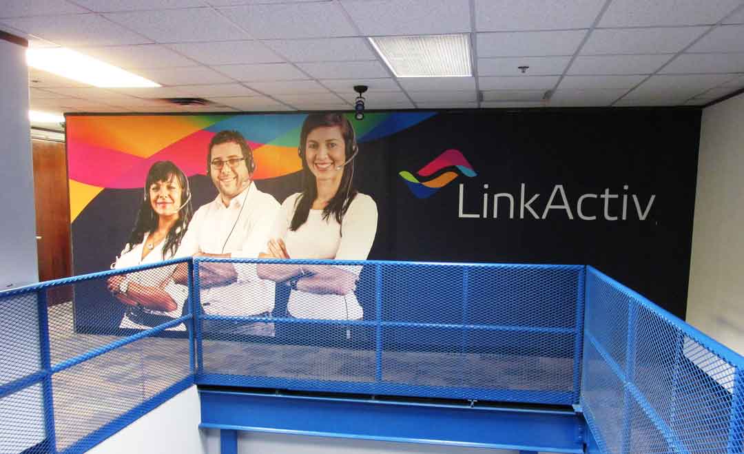
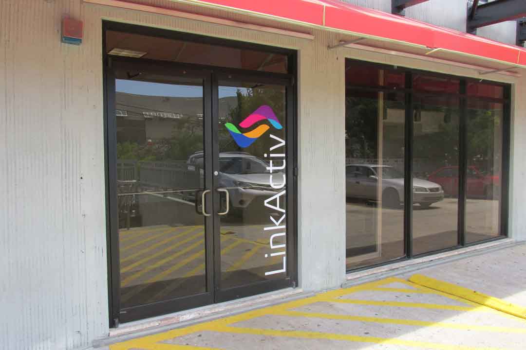
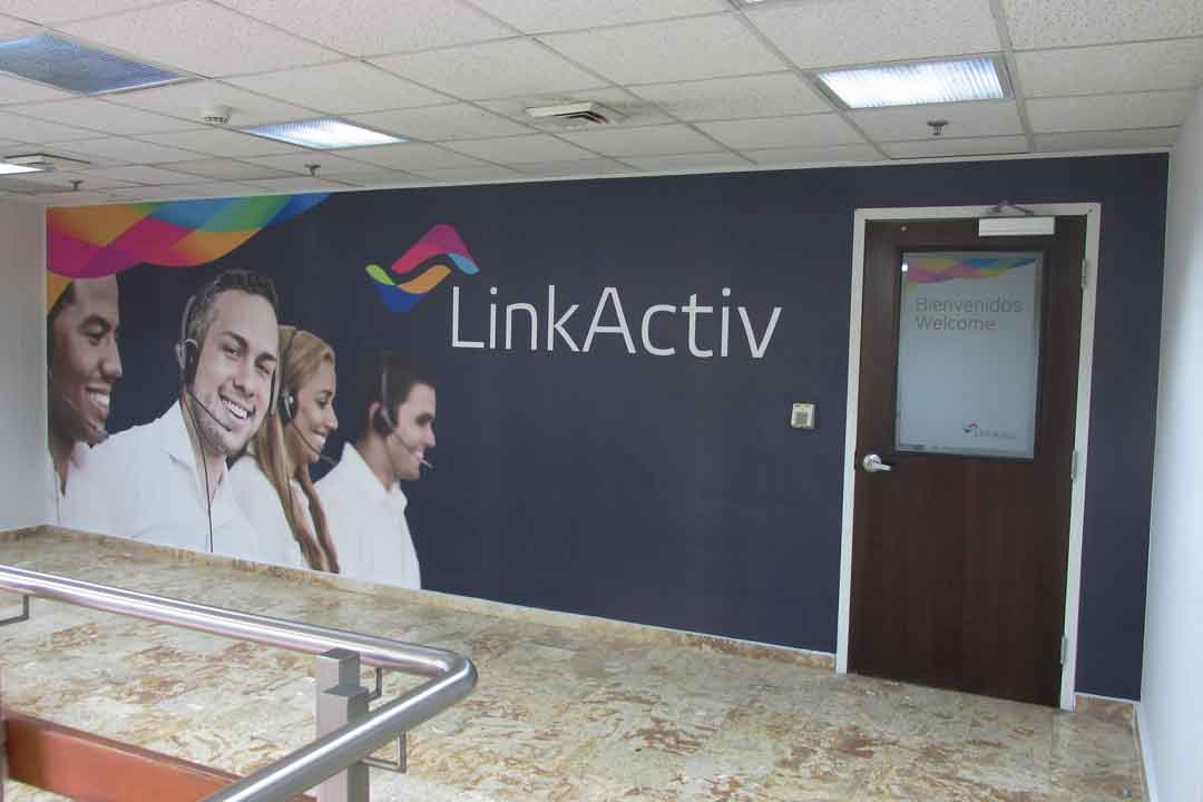
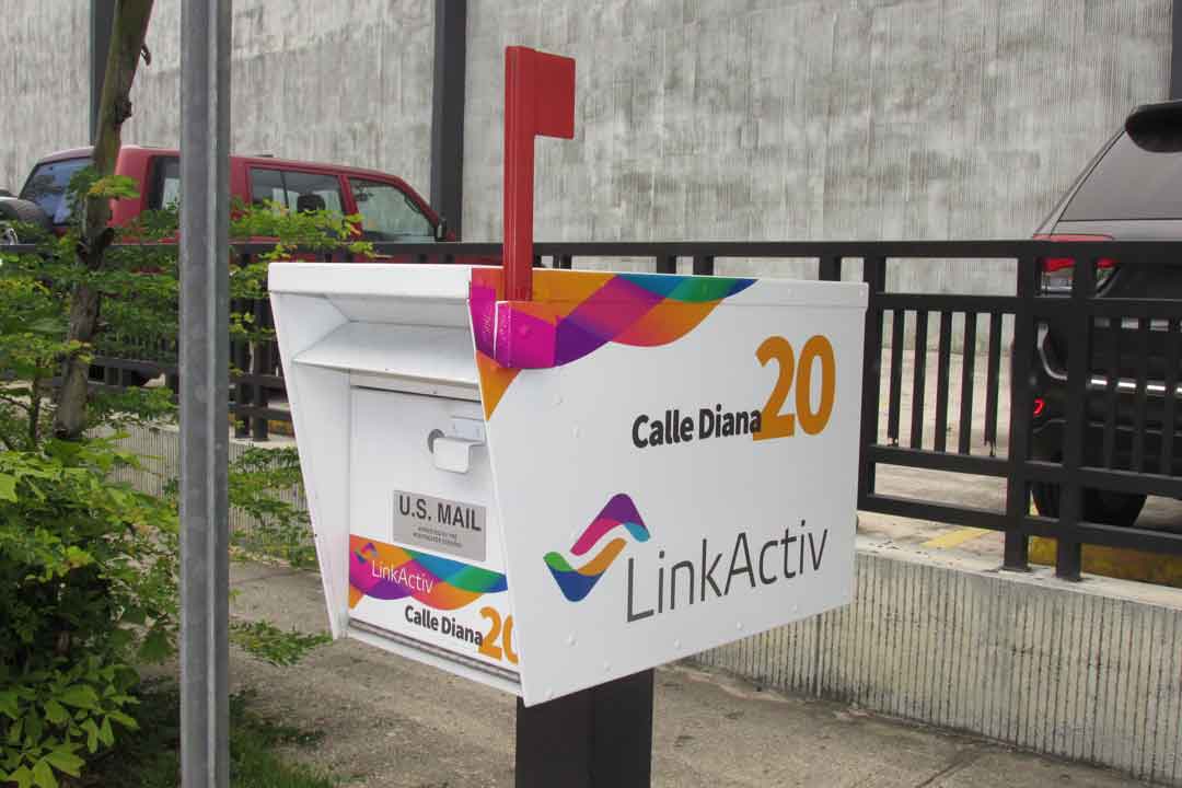
In designing the logo, my goal was to reflect both the diversity of markets served and the range of services offered, including direct marketing and consulting. The visual identity needed to convey diversity through color and a sense of activity through motion.
I imagined the initials “L” and “A” as two interlocking forms reminiscent of boomerangs—one outgoing and one returning. This visual metaphor of reciprocal movement symbolizes the interactive and responsive nature of LinkActiv’s client relationships, capturing the essence of the brand.