As a company who’s roots were in the installation and maintenance of cellular towers, Zellius struggled to communicate that they had expanded to provide a range of services for businesses and homes, such as internet (ISP), networking and connectivity.
As I reviewed the client’s brief, it became evident that Zellius needed to be all about communication. One way to bring this idea to life was by combining two apostrophes, as symbols of the spoken word, in a way that formed the brand’s Z in the white space between. The result was a design that spoke as much about the name of the brand, as it’s essence.
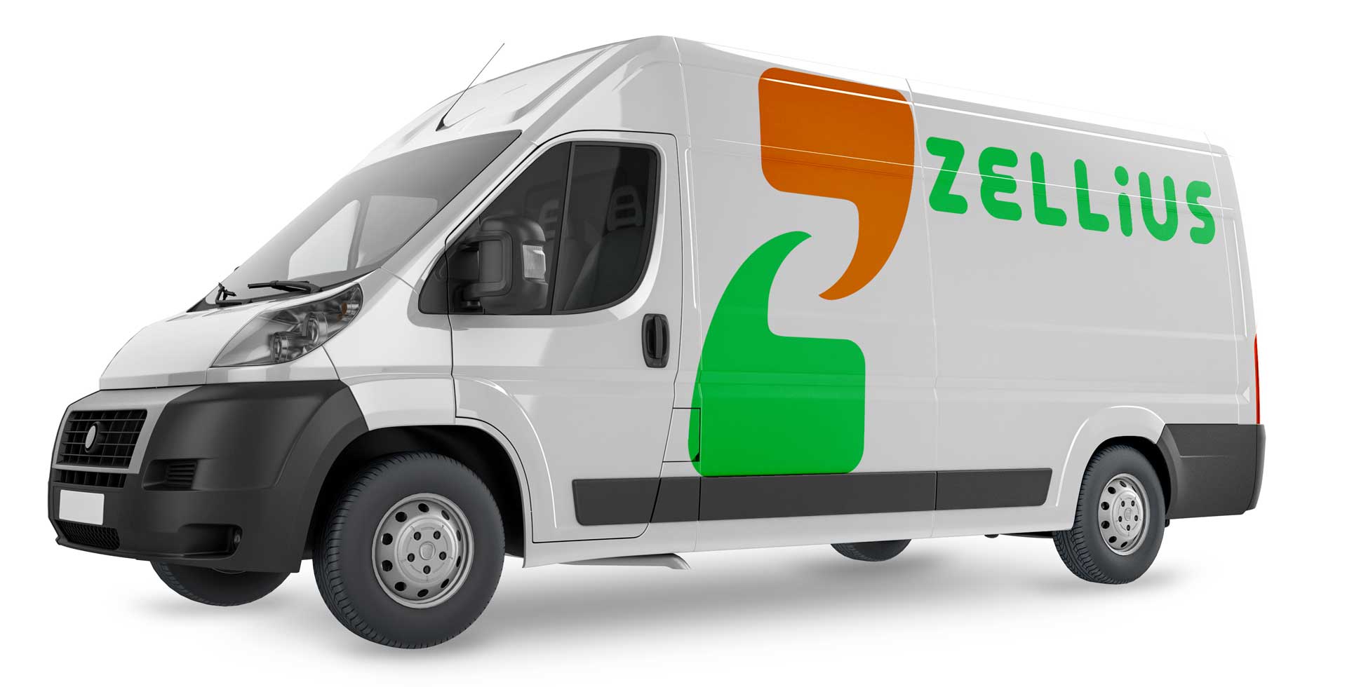
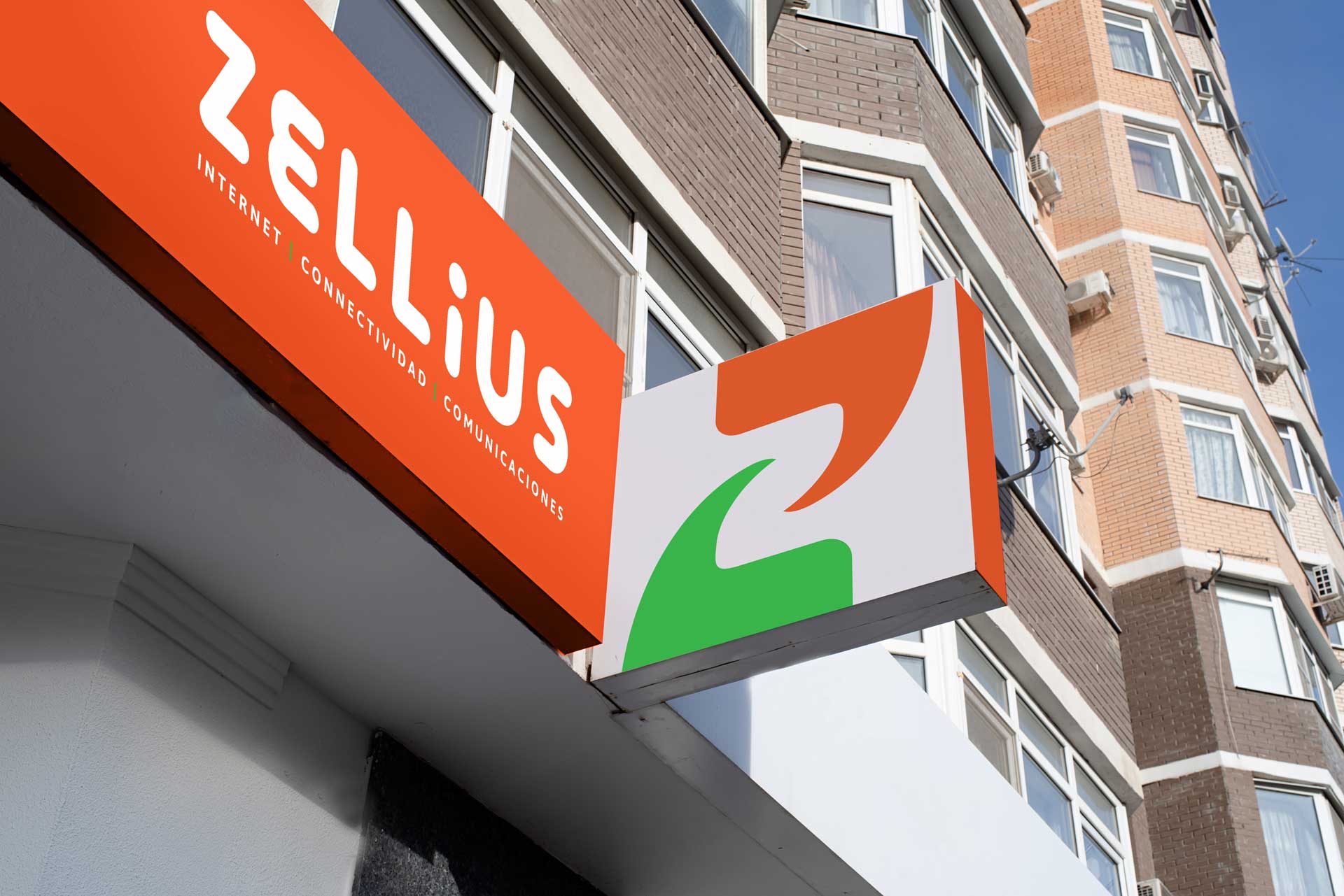
Another goal was to make the brand appeal to individuals, departing from the company’s corporate (B2B) roots. To achieve this I opted for bold curves, rounded edges and bright, secondary colors, that are friendly and approachable.